(Brief) Introduction to R! Problem Sets Solutions for PS 2
Solutions for PS 2
Initial Setup
# load relevant libraries
library(tidyverse)
library(lubridate)


# read in data (this step looks slightly different for me)
mobility <- read.csv("../../data/applemobilitytrends.csv")

# view the structure
str(mobility)
Question 1
# Since we are tidyverse experts, we can answer all these questions in one try:

mobility_CLT <- mobility %>%
  # step 1
  filter(region == "Charlotte",
         sub.region == "North Carolina",
         # step 3
         transportation_type == "driving") %>%
  # step 4
  pivot_longer(cols = starts_with("X"), names_to = "date", values_to = "volume") %>%
  # step 5
  mutate(date = str_remove_all(date, "[Xx.]"),
         # step 6
         date = ymd(date))

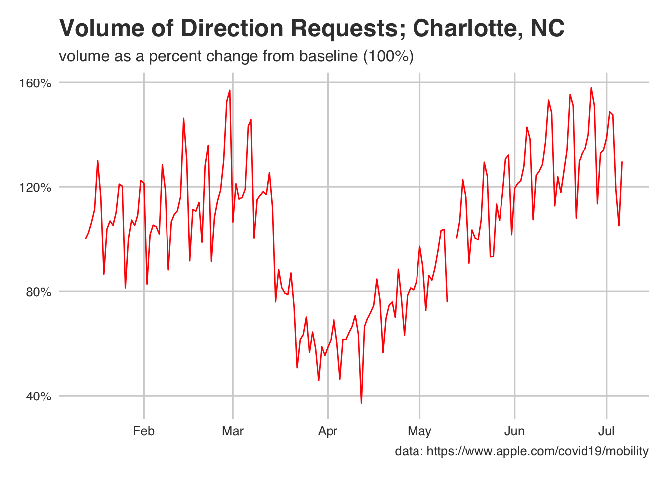
# Now to plot...
ggplot(mobility_CLT) +
  # dividing by 100 for the scales below... do not need to do so otherwise
  geom_line(aes(x = date, y = volume/100), color = "red") +
  # note, the top two lines would suffice but...
  #ggthemes::theme_fivethirtyeight() +
  labs(
    title = "Volume of Direction Requests; Charlotte, NC",
    subtitle = "volume as a percent change from baseline (100%)",
    x = "Date",
    y = "Volume",
    caption = "data: https://www.apple.com/covid19/mobility"
  ) +
  scale_y_continuous(labels = scales::percent)

Question 2
mobility_CLT2 <- mobility_CLT %>%
  # step 1
  mutate(weekday = wday(date)) %>%
  # step 2
  group_by(weekday) %>%
  summarise(avg_volume = mean(volume, na.rm = TRUE)) %>%
  # this not necessary for now
  # R needs to know weekday is categorical (not numerical)
  mutate(weekday = as.factor(weekday))


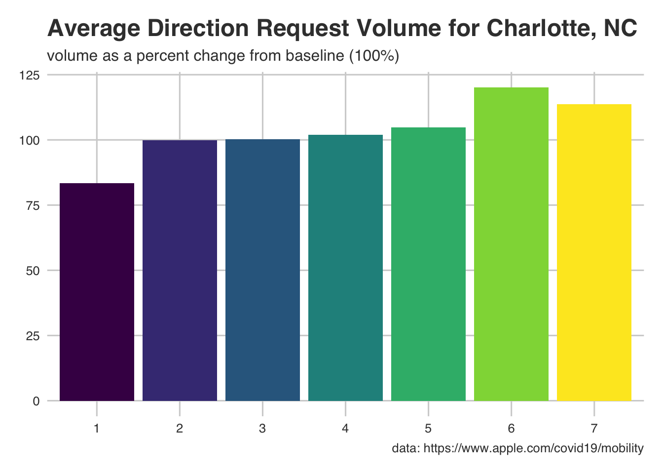
# Now to plot
ggplot(mobility_CLT2) +
  # make weekday a factor (it is categorical, not numerical)
  # This is important for the scale of your x axis
  # Try both!
  geom_bar(aes(x = weekday, y = avg_volume, fill = weekday), stat = "identity") +
  #ggthemes::theme_fivethirtyeight() +
  scale_fill_ordinal() +
  guides(fill = FALSE) +
  labs(
    title = "Average Direction Request Volume for Charlotte, NC",
    subtitle = "volume as a percent change from baseline (100%)",
    x = "Day of Week; 1 = Monday",
    y = "Volume",
    caption = "data: https://www.apple.com/covid19/mobility"
  )

Looks like we have our final answer! Day 6, or Saturday, has our highest volume on average. Of course, this is a fairly naive approach to time series data… but that wasn’t the point. Now you’re tidyverse/ggplot experts!